this is an unpopular opinion but i know the aesthetic reason for apple not implementing this for so long, and like eveything, it’s to make money.
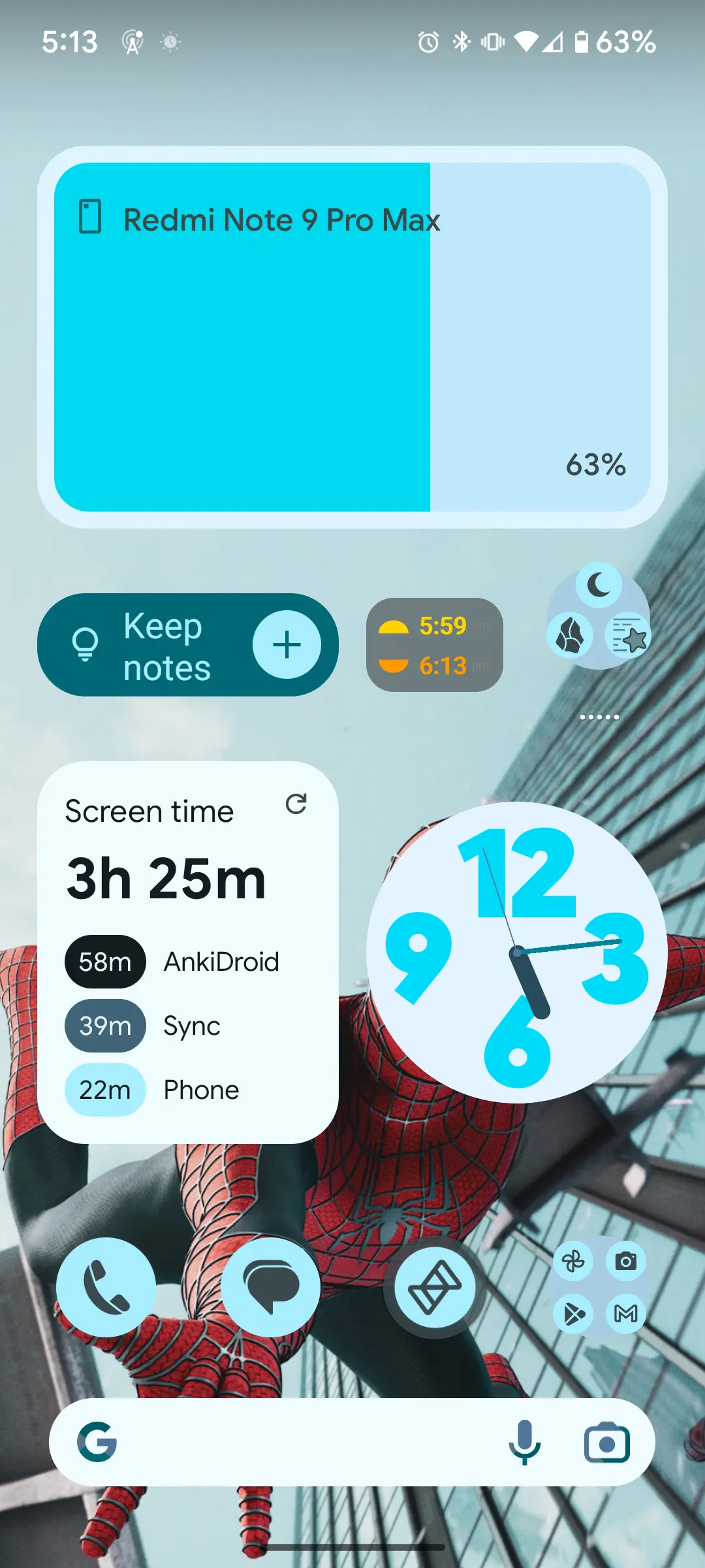
android design is pretty good, but user created android phones home screens can often look pretty hateful, often with 4-6 screens of more empty space than icons, tons of widgets with an inconsistent design scheme, random half empty folders and a notification bar overcrowded with overshrunk icons. android phones often look like old Windows XP desktops—even on flagship distributions.
in contrast to google, apple cares what your phone looks like because they have a highly visual brand.
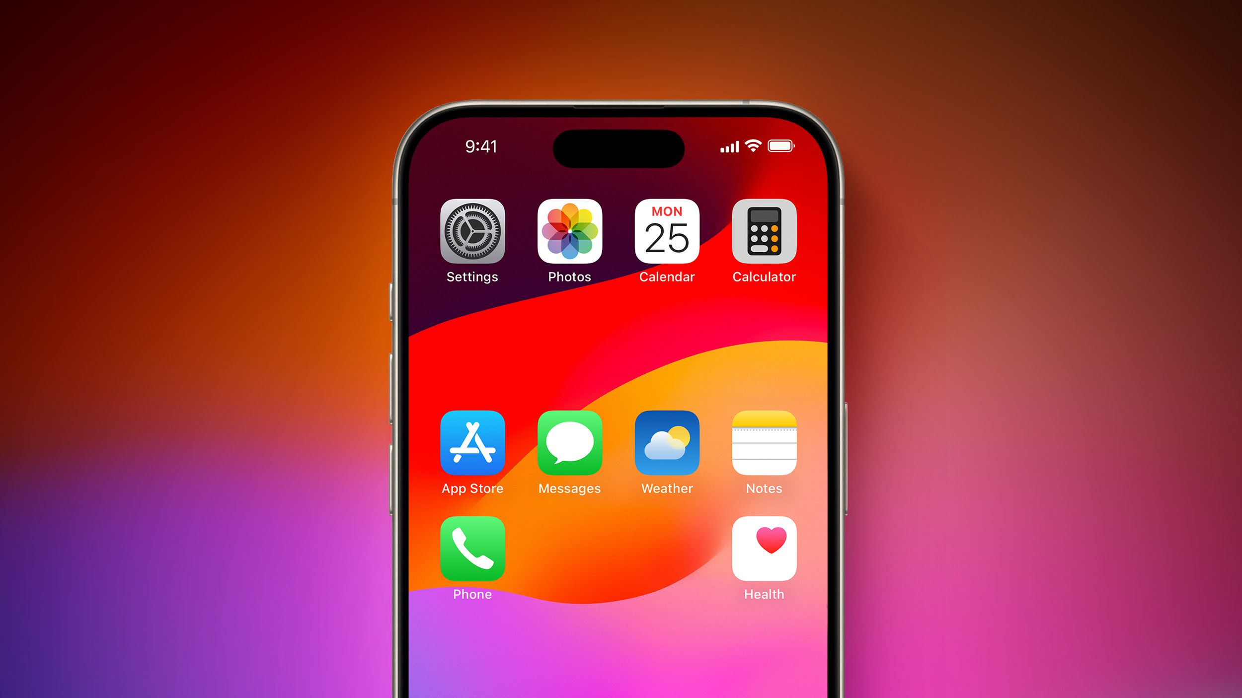
apple, by not allowing placement anywhere intentionally enforced a consistent top-left to bottom-right aesthetic which is now ubiquitous to the brand. among other design decisions, the result is that when you blur your eyes and look at a phone home screen you can tell whether it is apple or not.
- but the functionality is worse, yes i know.
- but it actually does look worse too, to you maybe, but not to apple. my belief is they did this for the same reason they put the magic mouse’s lighting port on the bottom (to keep users from always using it plugged in. which looks “ugly”).
the power of a strong and unmistakable brand is incomparable. in many cases, the value of a brand can even outperform raw product utility when it comes to customer satisfaction, a theory which i believe apple has been leveraging in this case very much intentionally despite the seeming paradox of utility.
edit: already getting downvoted to heck i should have known better than to be aware of basic marketing principles lol. i promise you im not defending apple im just explaining why they did this to make more money.
I’d be shocked if they just cloned Android’s default functionality and called it a day. Like the App Library, they’re probably going to try to have a unique spin on it, and will try to address some of the user experience quirks that a lot of iOS users don’t like.
I’ll bet money that it’s going to be pre structured layouts that look nice, like the Apple Watch, with one layout being “go nuts.” A CMS template system for the Home Screen.
I actually overall like the App Library, I just hate that the categories shift around seemingly at random. But I slowly keep removing more apps from the Home Screen; at some point my goal is to get down to one Home Screen with my most used apps and everything else is in the App Library.
i could definitely see that happening
You wrote all that and only used a single upper case letter. Impressive
i count at least three but thanks lol
Don’t second guess the willingness of an Apple-hater to spend that much time dissecting something bad Apple has done.
Your comment isn’t even that pro-Apple, and it’s much more generous towards Android’s design than you’d find on any other space titled apple_enthusiast.
And generally speaking isn’t that the exact reason they gave for not adding widgets right away? I thought this was more well known fact than an opinion.
i was getting close to -10 points for a second 😭 i guess the sane people that don’t just knee jerk vote were asleep
idk about the widgets lore i literally don’t follow apple at all i just happen to know about marketing and design stuff
I noticed lemmy to have way less reactionary voting compared to reddit. Your comment makes a lot of sense. Just look at this mess lol but at the end of the day it’s my phone and my mess.

I totally agree, and would argue that this enshittification for their own benefit began around the iPhone 4 and iOS 7. Things were beautiful to see in promotional videos but they wrecked years of visual conventions and features for aesthetics. The actively choose profits and aesthetics over their users.
I have to disagree on one point – that iOS home screens somehow look more orderly because they’re full of icons arranged in a strict top-left-to-bottom-right fashion. It doesn’t look any less cluttered than an overly full Windows desktop.
I found desktops that limit themselves to core functionality and maybe a nice wallpaper to be better looking and more usable since the days of Windows 95 and that hasn’t changed since.
That “strict grid of icons” look certainly is uniform across iDevices and that’s what appeals to Apple but I never found it to be particularly attractive.
we actually agree on this point. i don’t argue they look more orderly i argue they look uniform across the ecosystem which was central to my thesis :)
Wow… I never thought of the Magic Mouse thing, yet you’re entirely correct. Everyone would use it like that, and honestly it does look better without being plugged in (although everything else about it sucks, I hate that damn mouse)
thanks haha this is the first time ive brought up the mindset behind it without being called a shill or something 😭
i personally do like the magic mouse i like the lil touchpad on top but i can definitely see how it would suck weeeeeener for gaming or perhaps design applications, probably a lot more than those examples too
removed by mod
okay
Your explanation and the whole comment in general didn’t make me like and understand Apple. It made me understand and fiercely hate Apple products even more.
absolutely fair
The Magic Mouse thing is also about the battery, a battery kept plugged in all the time is more likely to swell.
It’s also about cable wear and tear. With a molded, fixed cable you can do proper boot and strain relief. A pluggable charge cable would be ribbons in like three months.


