You must log in or register to comment.
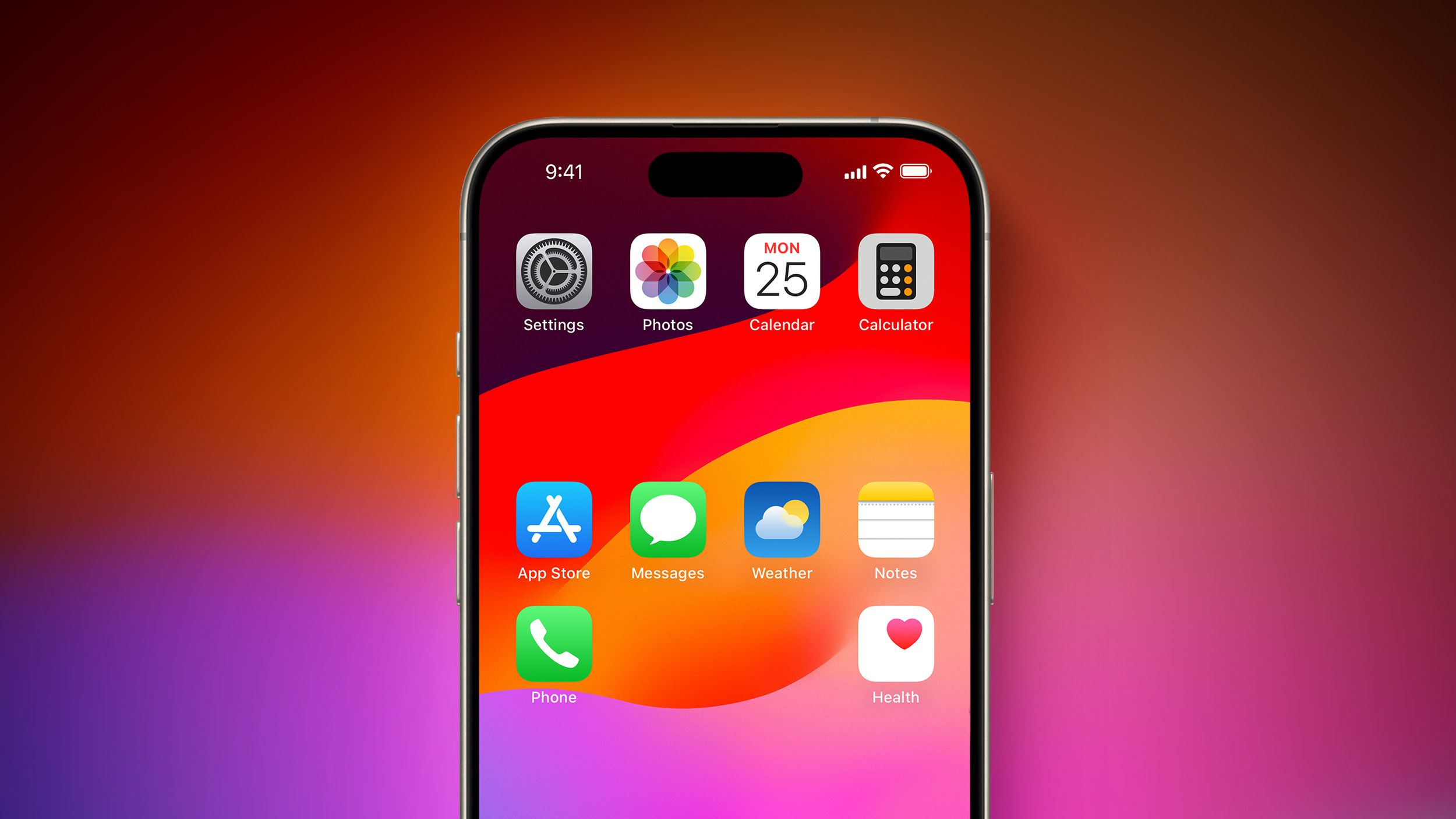
I have to disagree on one point – that iOS home screens somehow look more orderly because they’re full of icons arranged in a strict top-left-to-bottom-right fashion. It doesn’t look any less cluttered than an overly full Windows desktop.
I found desktops that limit themselves to core functionality and maybe a nice wallpaper to be better looking and more usable since the days of Windows 95 and that hasn’t changed since.
That “strict grid of icons” look certainly is uniform across iDevices and that’s what appeals to Apple but I never found it to be particularly attractive.
we actually agree on this point. i don’t argue they look more orderly i argue they look uniform across the ecosystem which was central to my thesis :)


