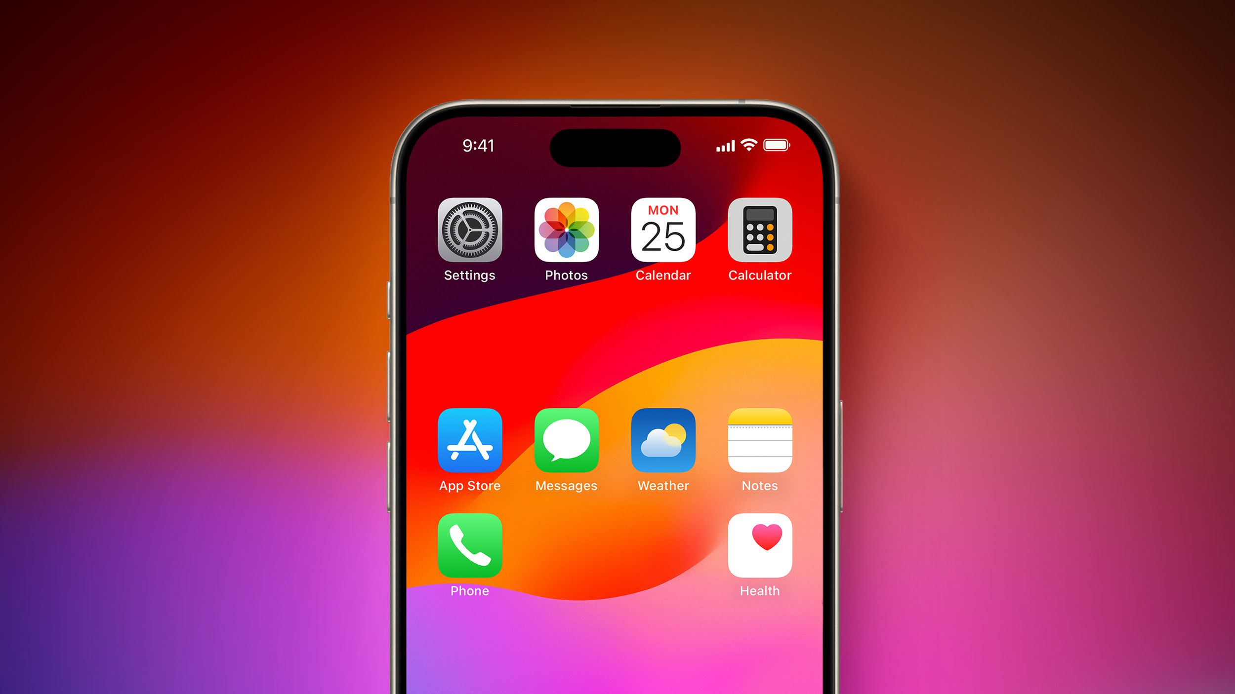
I’d be shocked if they just cloned Android’s default functionality and called it a day. Like the App Library, they’re probably going to try to have a unique spin on it, and will try to address some of the user experience quirks that a lot of iOS users don’t like.
I’ll bet money that it’s going to be pre structured layouts that look nice, like the Apple Watch, with one layout being “go nuts.” A CMS template system for the Home Screen.
i could definitely see that happening
I actually overall like the App Library, I just hate that the categories shift around seemingly at random. But I slowly keep removing more apps from the Home Screen; at some point my goal is to get down to one Home Screen with my most used apps and everything else is in the App Library.


